Onboarding onto PillPack
Guiding new customers through the PillPack service
The Approach
With a growing demographic and avenue into a new acquisition channel, customers signing up to the service needed another outlet to learn about the service through a non-digital means. I crafted a guide to help break through confusing jargon and to provide customers with a tangible brand moment right after signing up.
Project Highlights
- Working closely with the internal pharmacy teams
- Investigating different avenues to implement kit
- Understanding the new targeted demographic
I worked on
Branding
- Visual Design
- Art Direction
- Content Strategy
Research
- Customer Insights
- Prototyping
Application
- Production
Rethinking the process
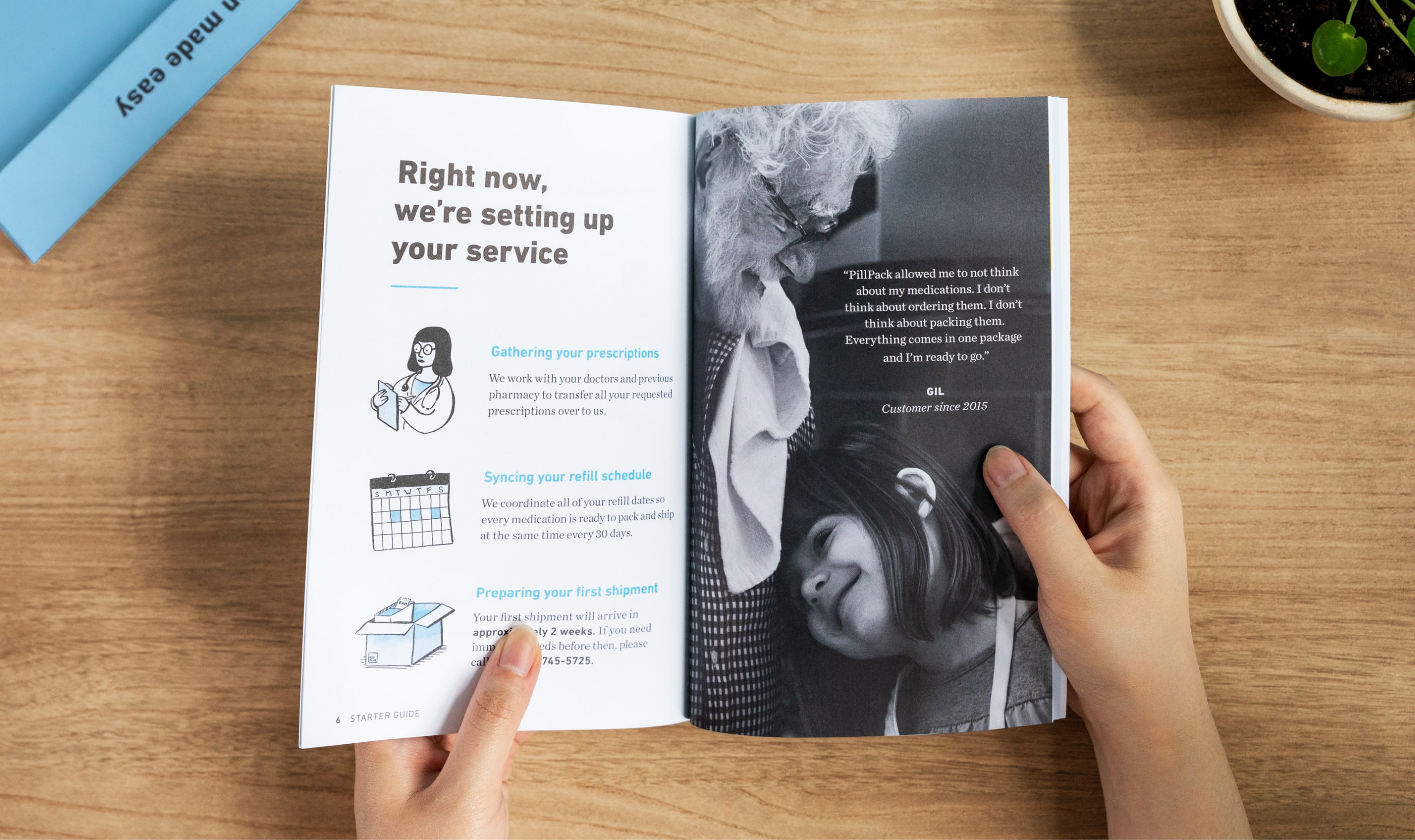
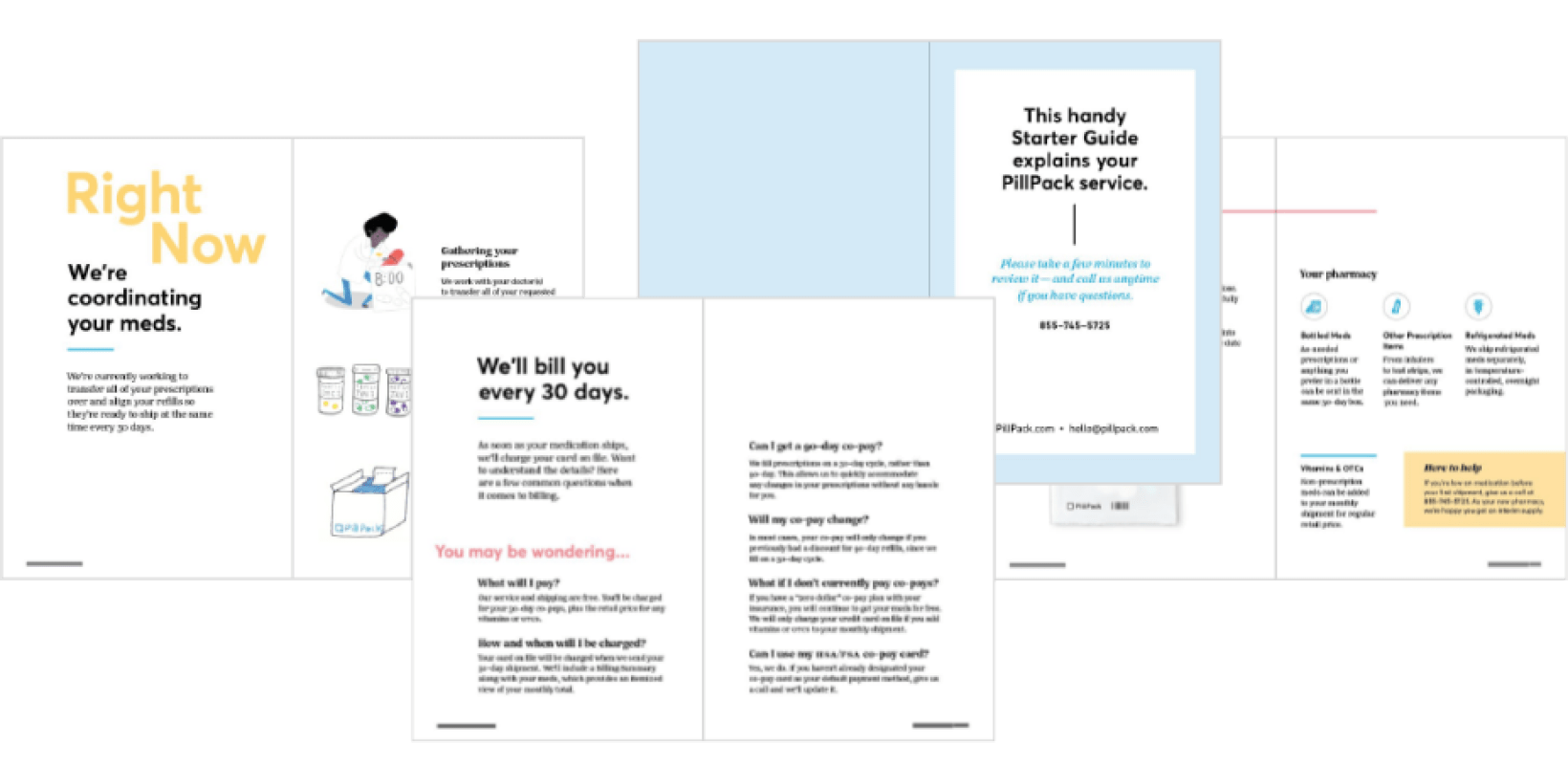
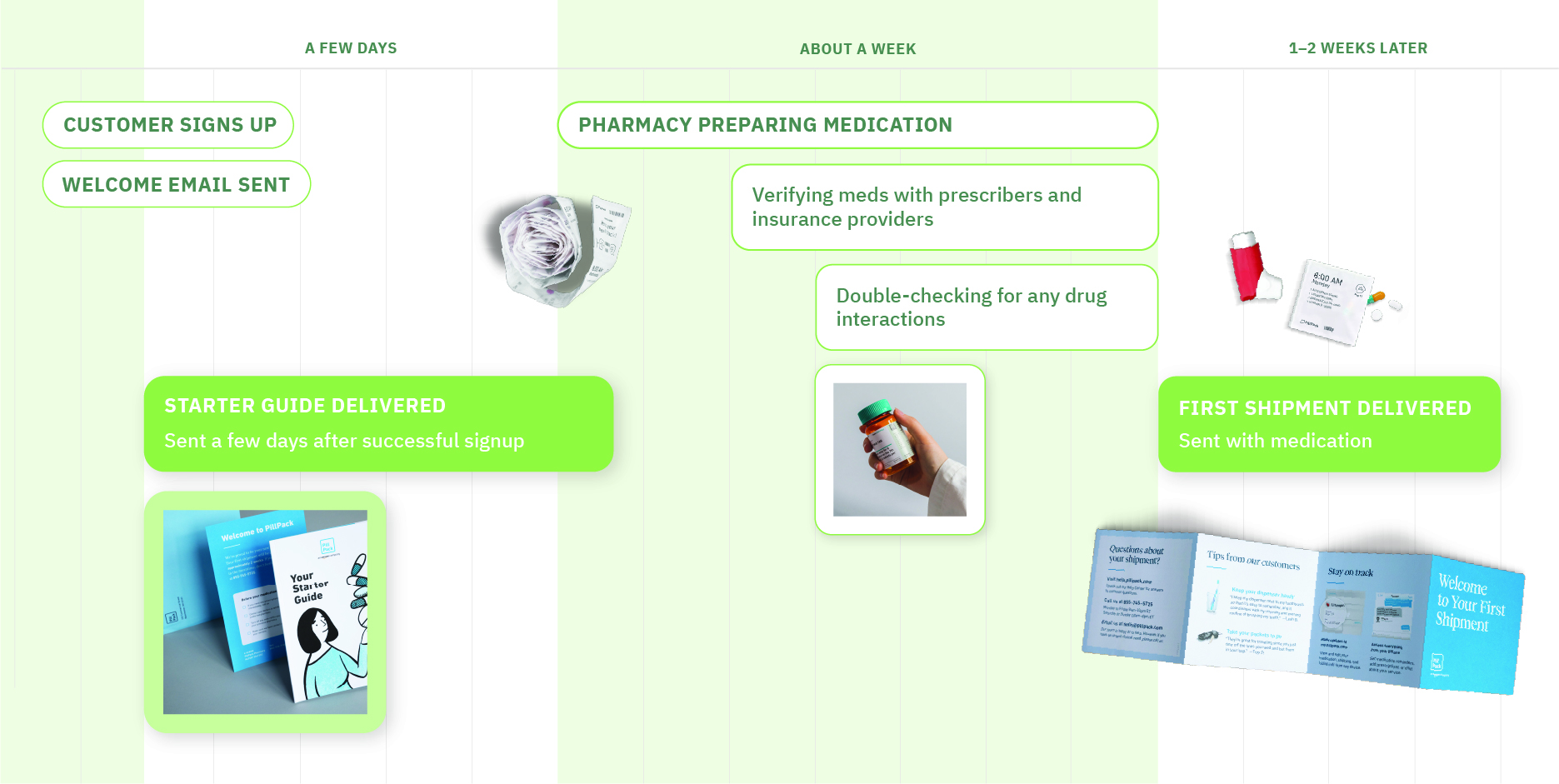
As the age demographic of our target audience rose, the need for a tangible touchpoint became an important moment for PillPack to properly welcome new customers and be present to answer any questions.
Before Sign Up
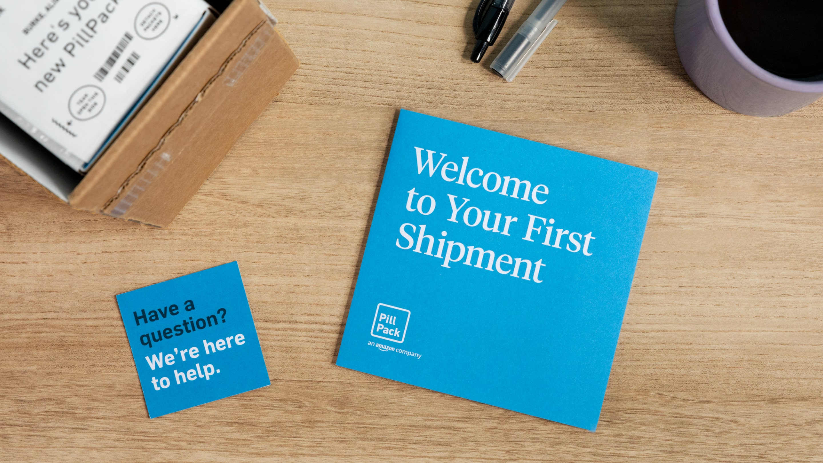
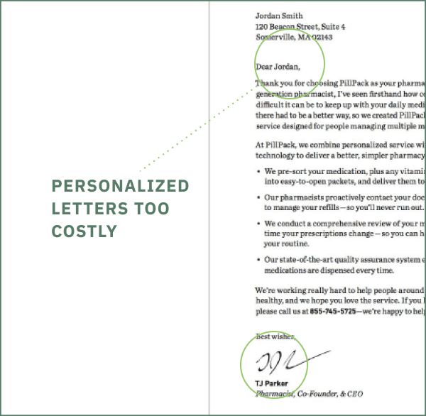
A brochure, letter, cards, and magnet was sent to everyone who signed up over the phone.
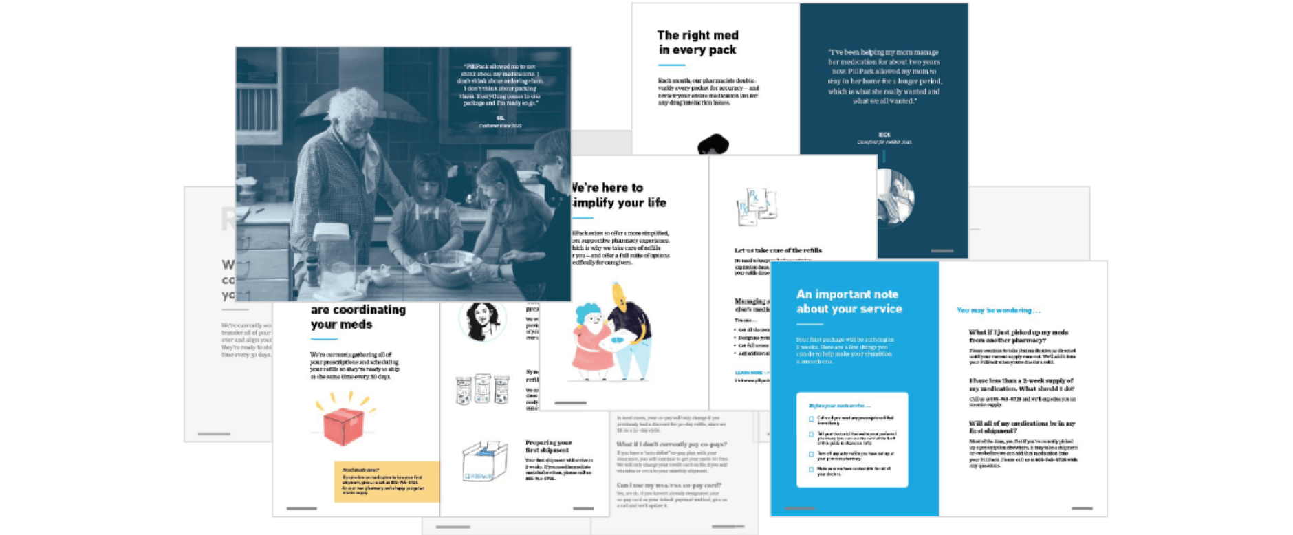
The welcome experience is a crucial point for the customers to solidify their switch to a new pharmacy. For the service, it’s an important time for us to monitor retention, maintain a smooth transition, and ensure that we are ready to guide them. For an already complicated process, I saw opportunities to make it easier for the customer. This project addressed these complications and refined the customer journey from sign up to receiving their first shipment.
After Sign Up
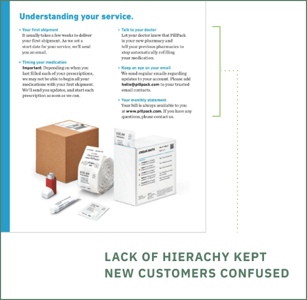
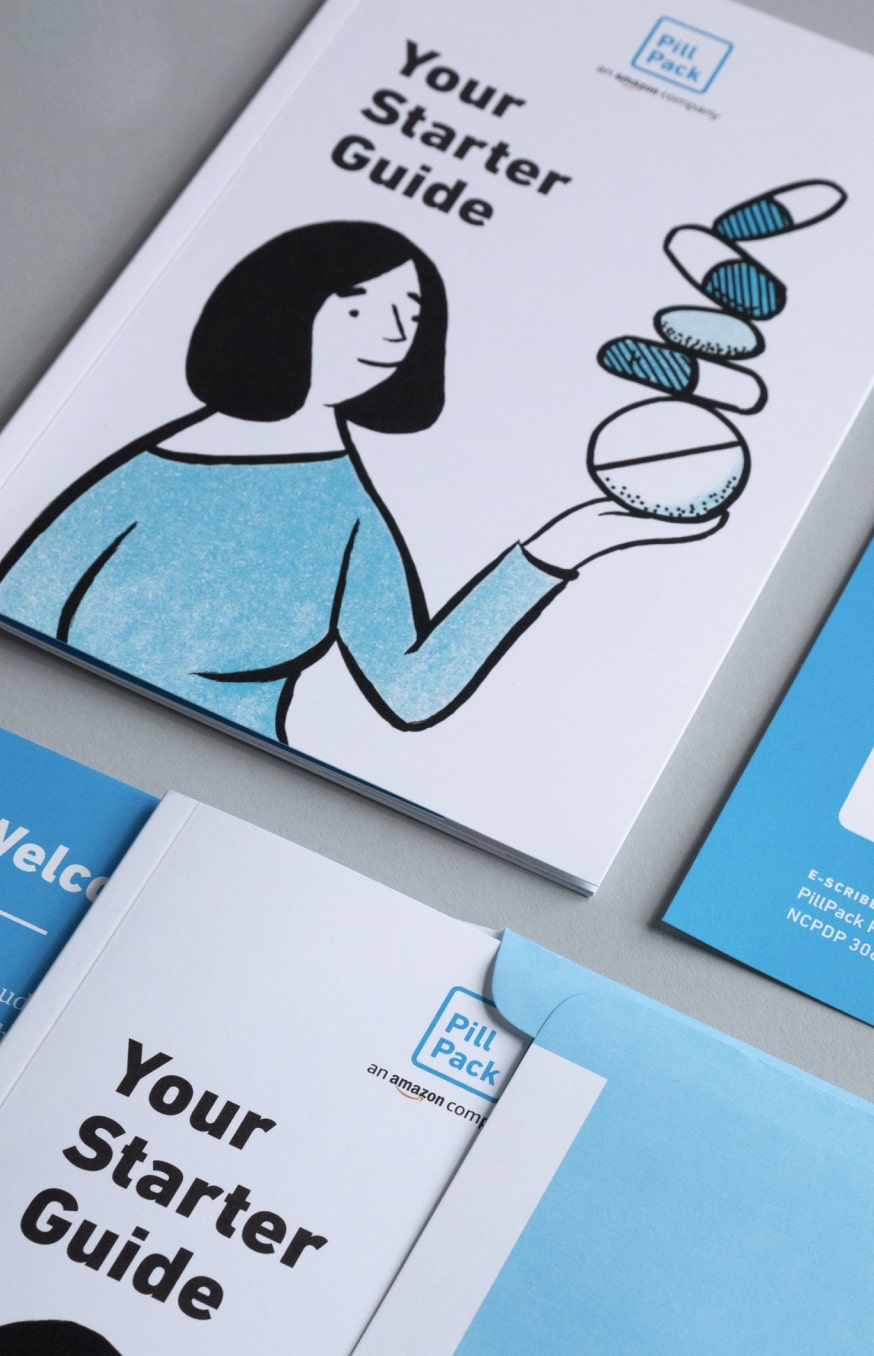
Customers also received a little book in their first shipment.
Things needed to change, and identifying these issues turned into directions in how to make the experience better for customers to get the right information. Along with our content strategist, we investigated the timing of the materials—from the outdated brand visuals, to the real points of confusion, the service needed to highlight what the main focuses are.
Things that needed to change
Those needs became goals
Sending too soon
The book was being sent out before people were confirmed as being eligible
Send only to confirmed customers
Only send to customers who’ve made it through the prequal process
Doesn’t answer key questions
There wasn’t enough room to address immediate needs for people who’ve just signed up
Answer common questions
Address common new customer issues, based on responses from surveys
Not eye-catching
The standard, white envelope size was getting lost in a sea of junk mail and bills — it would get thrown away before being opened
Stand out from the mail pile
A colorful, non-standard envelope that will stand out from the mail pile
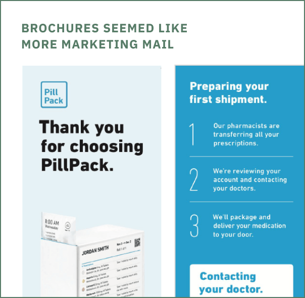
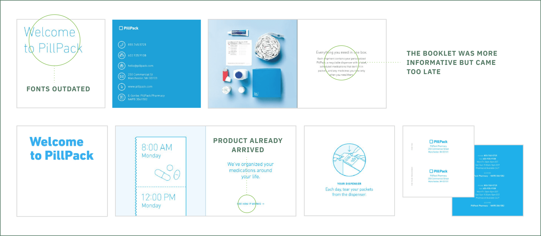
Details are outdated
Because we move quickly, many of the details within the brochure were out of date
Adapt as needed
Allow for continuous evolution, to incorporate service changes and customer feedback
Feels like marketing
The brochure format felt like marketing material, not a service moment
Speak as a service
Make clear that the recipient is a new customer and speak to them from a service standpoint
Addressing changes to become goals
Sending too soon
The book was being sent out before people were confirmed as being eligible
Send only to confirmed customers
Only send to customers who’ve made it through the prequal process
Doesn’t answer key questions
There wasn’t enough room to address immediate needs for people who’ve just signed up
Answer common questions
Address common new customer issues, based on responses from surveys
Not eye-catching
The standard, white envelope size was getting lost in a sea of junk mail and bills — it would get thrown away before being opened
Stand out from the mail pile
A colorful, non-standard envelope that will stand out from the mail pile
Details are outdated
Because we move quickly, many of the details within the brochure were out of date
Adapt as needed
Allow for continuous evolution, to incorporate service changes and customer feedback
Feels like marketing
The brochure format felt like marketing material, not a service moment
Speak as a service
Make clear that the recipient is a new customer and speak to them from a service standpoint
Putting it into words
The goal was to explain the service concisely from a range of readers who may not know anything about the service to the people who need clarification of their new service. I worked closely with a content strategist on making sure the right information was being prioritized.
Talking to the experts
Through multiple rounds and many trips to the pharmacy, we talked to the teams who worked the closest with the customers and prescribers. These were the people who welcome customers on the phone and kept track of what keeps them happy. We were able to address the right language and connect the dots to see how the work of one team impacted other work streams. We wanted to create a more fluid path by understanding the teams’ roles, their issues, and what their goals were.
Marketing
Planning the right triggers sets up the right expectations for customers and helps relay the right education.
Design
The materials did not feel like a product of the pharmacy and we wanted a consistent look and feel to be branded.
Product
It was important to relay the service offerings at the right time and help the customer understand their service.
Pharmacy
This team helped keep our info in check and emphasized the importance of the customer’s role to their prescriber.
Welcome Team
As common answers were left unanswered, unloading the educational efforts for them was a priority to ease signup.
Retention
The right expectations needed to be clear at the beginning of customers’ service to reduce escalations to a minimum.
Our Learnings
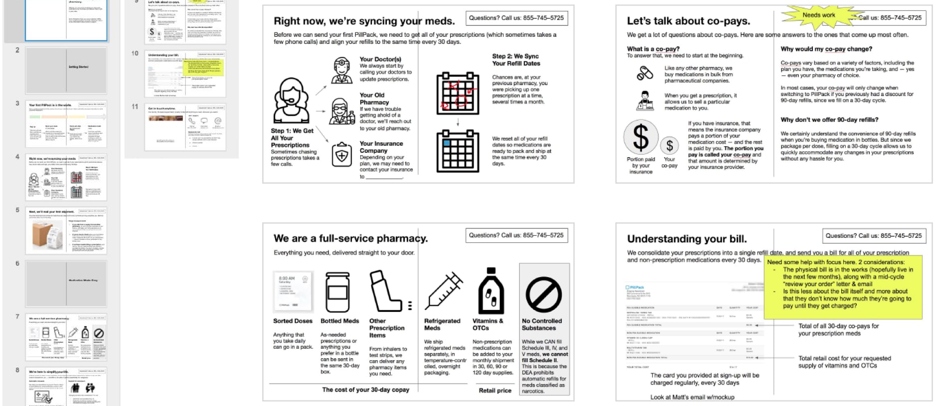
Customers don’t understand how their own copays work
Terminology is confusing; like ‘transfer’ is not customer-facing, but ‘interim supply’ is
Customer service weren’t using the term OTC (over-the-counter)
The timing of when to go to old pharmacy vs. calling us for any issues was the most common issue
Making compromises
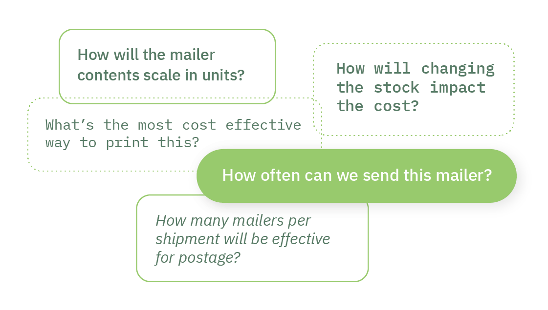
As a first version to a new kind of audience, finding the right kind of budget for testing had to be considered. I kept the balance of finding the right cost for Marketing without compromising the mailer from page count and distinction.
Weighing Options
Less pages = less money
Less objects = less money
More mailings = more precision
More direction = more clarity

Finding the right feel
The materials needed to evoke the right emotion between informative yet friendly. To serve different use cases and depict unique situations, we opted to find the right kind of illustration for the wide range of audiences.
In the right hands
Working with the Marketing team, we timed the right triggers as to when the customer can receive the right information at the right time. Timing these touchpoints ensured customers were kept in the loop.